How To Create & Publish A React Library
A guide for new library authors who want to create reusable libraries for React.
Assalam u Alaikum & Hello Everyone! 👋
I hope you all are good ✨🤗
Background
Building a React library is nothing but building a react application itself. You just have to make it more reusable and customizable so that other developers can use them effectively.
Over the past three years, I have been working with React almost the majority of the time. I love this library and the echo system. Recently at my job, we had to deliver a POC (Proof of concept) for a startup project, and the client had a requirement to build this POC as a library.
That's when I jumped in and took the responsibility to design and build it with the amazing people in the team.
Let's start ✨
Introduction
To build any library, you can divide the overall lifecycle into these 5 steps:
- Tooling
- Development
- Testing
- Bundling & Optimizations
- Publishing
In this article, we are going to build a small Cyberpunk Button library in which we will practice all these steps one by one.
We will build a reusable Cyberpunk theme button and will publish it to npm so that anyone can use it. Just to simulate the overall process.
We will use code from this amazing pen: codepen.io/jh3y/pen/PoGbxLp
1. Tooling
Tbh, Tooling is hard! Creating configurations for bundlers, transpilers & whatnot. Therefore, the community has also built some amazing tools out of the box for new library authors so that they can focus on building the library, not the tooling itself.
One of the amazing tools that are helping developers to build libraries is create-react-library which is a CLI tool to create react libraries.
Here are some of the features that create-react-library provides out of the box:
- Easy-to-use CLI
- Handles all modern JS features
- Bundles commonjs and es module formats
create-react-appproject for testing and local development- Rollup for bundling & Babel for transpiling
- Jest for testing
- Supports complicated peer-dependencies
- Supports CSS modules
- Optional support for TypeScript
- Sourcemap creation
Trust me, this is too much shipped in one box for your feasibility. Plus you can always customize this set of tooling. Please read the documentation.
2. Let's Build Our Library
1. Installing create-react-library
Let's install create-react-library first and bootstrap our library with it.
# To install globally
npm install -g create-react-library

# Using npx
npx create-react-library
After the installation, you can just create a new library project using the create-react-library command. It will start a setup wizard and will ask basic questions about your library.
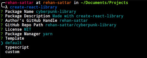
You can choose the default (JavaScript) template & also typescript if you want. And if you have your customized file structure, please select custom. I'm going with the default one.
After selecting the template, it will create the folder structure & will install all the dependencies for you!
2. Understanding the project Structure
- 📂 cyberpunk-library
  - 📄 README.md
  - 📂 dist  # Contains all the build files of your library.
    - 📄 index.css
    - 📄 index.js
    - 📄 index.js.map
    - 📄 index.modern.js
    - 📄 index.modern.js.map
  - 📂 example  # A small react application for testing your library.
    - 📄 README.md
    - 📄 node_modules
    - 📄 package.json
    - 📂 public
      - 📄 favicon.ico
      - 📄 index.html
      - 📄 manifest.json
    - 📂 src
      - 📄 App.js
      - 📄 App.test.js
      - 📄 index.css
      - 📄 index.js
    - 📄 yarn.lock
  - 📄 node_modules
  - 📄 package.json
  - 📂 src # The main code of your library.
    - 📄 index.js
    - 📄 index.test.js
    - 📄 styles.module.css
  - 📄 yarn.lock
The directory structure is pretty much self-explanatory. We have the src folder at the root which is going to contain our library code. Now it's up to us how we structure our library inside of the src folder.
After the project is created, you can run the initial boilerplate code by using these commands:
- Run
npm startat the root of your project to start the library compilation. - Run
npm startinside theexamplefolder to see the library in action.
If you get any error while running your example project, please delete the
node_modulesinside the examples folder and do a freshnpm install. After it, please run the example directory project usingnpm startagain.
3. Coding the Library
Let's start developing our cyberpunk button library now.
Create a new file in the src directory and name it Button.js, which is going to contain the React component.
Our goal is to design this component:
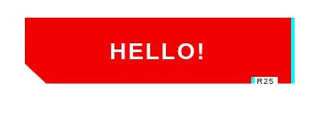
We will have a total of three props.
label- The text shown on the button. By default, it's 'Button'.glitchLabel- Since we have a glitch animation, if we want to show any other label on this animation, we can add it here. Otherwise, it's will show the label while glitching.tag- The tag at the bottom of the button. For now, we are always showing it. But you can always customize the button to your needs. The default is set to 'R25'
For now, we won't be doing any customization for the styling. You can do it but for the sake of this article, I'm keeping it simple. Thanks
import React from 'react'
import styles from './styles.module.css'

export const Button = ({
  label = 'Button',
  glitchLabel,
  tag = 'R25'
}) => {
  return (
    <button className={styles.cyber_btn}>
      {label}
      <span aria-hidden className={styles.cyber_btn__glitch}>
        {glitchLabel || label}
      </span>
      <span aria-hidden className={styles.cyber_btn__tag}>
        {tag}
      </span>
    </button>
  )
}
As you can see, we are using CSS modules. Since create-react-library supports CSS modules, we can use them. You can also use plain CSS as well.
Let's add the styles in our styles.module.css file.
* {
  box-sizing: border-box;
}

body {
  display: flex;
  align-items: center;
  flex-direction: column;
  justify-content: center;
  min-height: 100vh;
}

body .cyber_btn + .cyber_btn {
  margin-top: 2rem;
}

.cyber_btn {
  --primary: hsl(var(--primary-hue), 85%, calc(var(--primary-lightness, 50) * 1%));
  --shadow-primary: hsl(var(--shadow-primary-hue), 90%, 50%);
  --primary-hue: 0;
  --primary-lightness: 50;
  --color: hsl(0, 0%, 100%);
  --font-size: 26px;
  --shadow-primary-hue: 180;
  --label-size: 9px;
  --shadow-secondary-hue: 60;
  --shadow-secondary: hsl(var(--shadow-secondary-hue), 90%, 60%);
  --clip: polygon(0 0, 100% 0, 100% 100%, 95% 100%, 95% 90%, 85% 90%, 85% 100%, 8% 100%, 0 70%);
  --border: 4px;
  --shimmy-distance: 5;
  --clip-one: polygon(0 2%, 100% 2%, 100% 95%, 95% 95%, 95% 90%, 85% 90%, 85% 95%, 8% 95%, 0 70%);
  --clip-two: polygon(0 78%, 100% 78%, 100% 100%, 95% 100%, 95% 90%, 85% 90%, 85% 100%, 8% 100%, 0 78%);
  --clip-three: polygon(0 44%, 100% 44%, 100% 54%, 95% 54%, 95% 54%, 85% 54%, 85% 54%, 8% 54%, 0 54%);
  --clip-four: polygon(0 0, 100% 0, 100% 0, 95% 0, 95% 0, 85% 0, 85% 0, 8% 0, 0 0);
  --clip-five: polygon(0 0, 100% 0, 100% 0, 95% 0, 95% 0, 85% 0, 85% 0, 8% 0, 0 0);
  --clip-six: polygon(0 40%, 100% 40%, 100% 85%, 95% 85%, 95% 85%, 85% 85%, 85% 85%, 8% 85%, 0 70%);
  --clip-seven: polygon(0 63%, 100% 63%, 100% 80%, 95% 80%, 95% 80%, 85% 80%, 85% 80%, 8% 80%, 0 70%);
  font-family: 'Cyber', sans-serif;
  color: var(--color);
  cursor: pointer;
  background: transparent;
  text-transform: uppercase;
  font-size: var(--font-size);
  outline: transparent;
  letter-spacing: 2px;
  position: relative;
  font-weight: 700;
  border: 0;
  min-width: 300px;
  height: 75px;
  line-height: 75px;
  transition: background 0.2s;
}

.cyber_btn:hover {
  --primary: hsl(var(--primary-hue), 85%, calc(var(--primary-lightness, 50) * 0.8%));
}
.cyber_btn:active {
  --primary: hsl(var(--primary-hue), 85%, calc(var(--primary-lightness, 50) * 0.6%));
}

.cyber_btn:after,
.cyber_btn:before {
  content: '';
  position: absolute;
  top: 0;
  left: 0;
  right: 0;
  bottom: 0;
  clip-path: var(--clip);
  z-index: -1;
}

.cyber_btn:before {
  background: var(--shadow-primary);
  transform: translate(var(--border), 0);
}

.cyber_btn:after {
  background: var(--primary);
}

.cyber_btn__tag {
  position: absolute;
  padding: 1px 4px;
  letter-spacing: 1px;
  line-height: 1;
  bottom: -5%;
  right: 5%;
  font-weight: normal;
  color: hsl(0, 0%, 0%);
  font-size: var(--label-size);
}

.cyber_btn__glitch {
  position: absolute;
  top: calc(var(--border) * -1);
  left: calc(var(--border) * -1);
  right: calc(var(--border) * -1);
  bottom: calc(var(--border) * -1);
  background: var(--shadow-primary);
  text-shadow: 2px 2px var(--shadow-primary), -2px -2px var(--shadow-secondary);
  clip-path: var(--clip);
  animation: glitch 2s infinite;
  display: none;
}

.cyber_btn:hover .cyber_btn__glitch {
  display: block;
}

.cyber_btn__glitch:before {
  content: '';
  position: absolute;
  top: calc(var(--border) * 1);
  right: calc(var(--border) * 1);
  bottom: calc(var(--border) * 1);
  left: calc(var(--border) * 1);
  clip-path: var(--clip);
  background: var(--primary);
  z-index: -1;
}

@keyframes glitch {
  0% {
    clip-path: var(--clip-one);
  }
  2%,
  8% {
    clip-path: var(--clip-two);
    transform: translate(calc(var(--shimmy-distance) * -1%), 0);
  }
  6% {
    clip-path: var(--clip-two);
    transform: translate(calc(var(--shimmy-distance) * 1%), 0);
  }
  9% {
    clip-path: var(--clip-two);
    transform: translate(0, 0);
  }
  10% {
    clip-path: var(--clip-three);
    transform: translate(calc(var(--shimmy-distance) * 1%), 0);
  }
  13% {
    clip-path: var(--clip-three);
    transform: translate(0, 0);
  }
  14%,
  21% {
    clip-path: var(--clip-four);
    transform: translate(calc(var(--shimmy-distance) * 1%), 0);
  }
  25% {
    clip-path: var(--clip-five);
    transform: translate(calc(var(--shimmy-distance) * 1%), 0);
  }
  30% {
    clip-path: var(--clip-five);
    transform: translate(calc(var(--shimmy-distance) * -1%), 0);
  }
  35%,
  45% {
    clip-path: var(--clip-six);
    transform: translate(calc(var(--shimmy-distance) * -1%));
  }
  40% {
    clip-path: var(--clip-six);
    transform: translate(calc(var(--shimmy-distance) * 1%));
  }
  50% {
    clip-path: var(--clip-six);
    transform: translate(0, 0);
  }
  55% {
    clip-path: var(--clip-seven);
    transform: translate(calc(var(--shimmy-distance) * 1%), 0);
  }
  60% {
    clip-path: var(--clip-seven);
    transform: translate(0, 0);
  }
  31%,
  61%,
  100% {
    clip-path: var(--clip-four);
  }
}

.cyber_btn:nth-of-type(2) {
  --primary-hue: 260;
}
After adding the styles, we can export our newly created component from the library to use it anywhere. We will do it in the index.js file at the root.
import { Button } from './Button'

export default Button
3. Testing
You can test your component by navigating to the example directory and running yarn start or npm start.
Inside the example folder, there is a complete react project just like any react project which will consume our library.
example/src/App.js
import React from 'react'

// loading the library component
import CyberpunkButton from 'cyberpunk-library'
// loading the CSS
import 'cyberpunk-library/dist/index.css'

const App = () => {
  return <CyberpunkButton label='Hello!'></CyberpunkButton>
}

export default App
There you go! You can now develop and test your library alongside. That is one of the very good reasons to use create-react-library.
4. Bundling & Optimization
After creating your library, you can optimize it and reduce the bundle size. We are using create-react-library and it already uses some techniques to generate an optimized bundle for the library.
If you want to optimize more, you can always configure rollup and parsers.
5. Shipping the library to NPM
You can publish your library to npm via running only npm publish or yarn publish. It's a widget that will ask you some questions related to publishing your library over npm.
It's going to ask you three questions:
- Your npm username
- Your npm email
- Your npm password to authenticate.
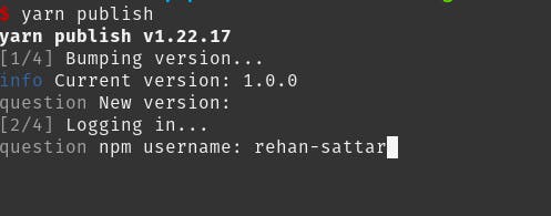
After providing the credentials, it will automatically publish your package to the npm registry.
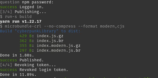
After publishing the library, go to your profile and you'll see the new library over there.

Congratulations! You have created and published your first react library 🚀
Conclusion
If you want to create a library in react, you don't have to worry much about the configurations and build management until and unless the requirements are out of the box.
A lot of tools and informative blogs/videos are there for your guidance. The community is always happy to welcome open-source projects and libraries. You just have to take the steps.
I hope this article was a good read for you. Follow me over my socials and if you like my work, you can help me by sponsoring me 😀
That's it, folks! Thank you! ✨

